The Miami Streets Project
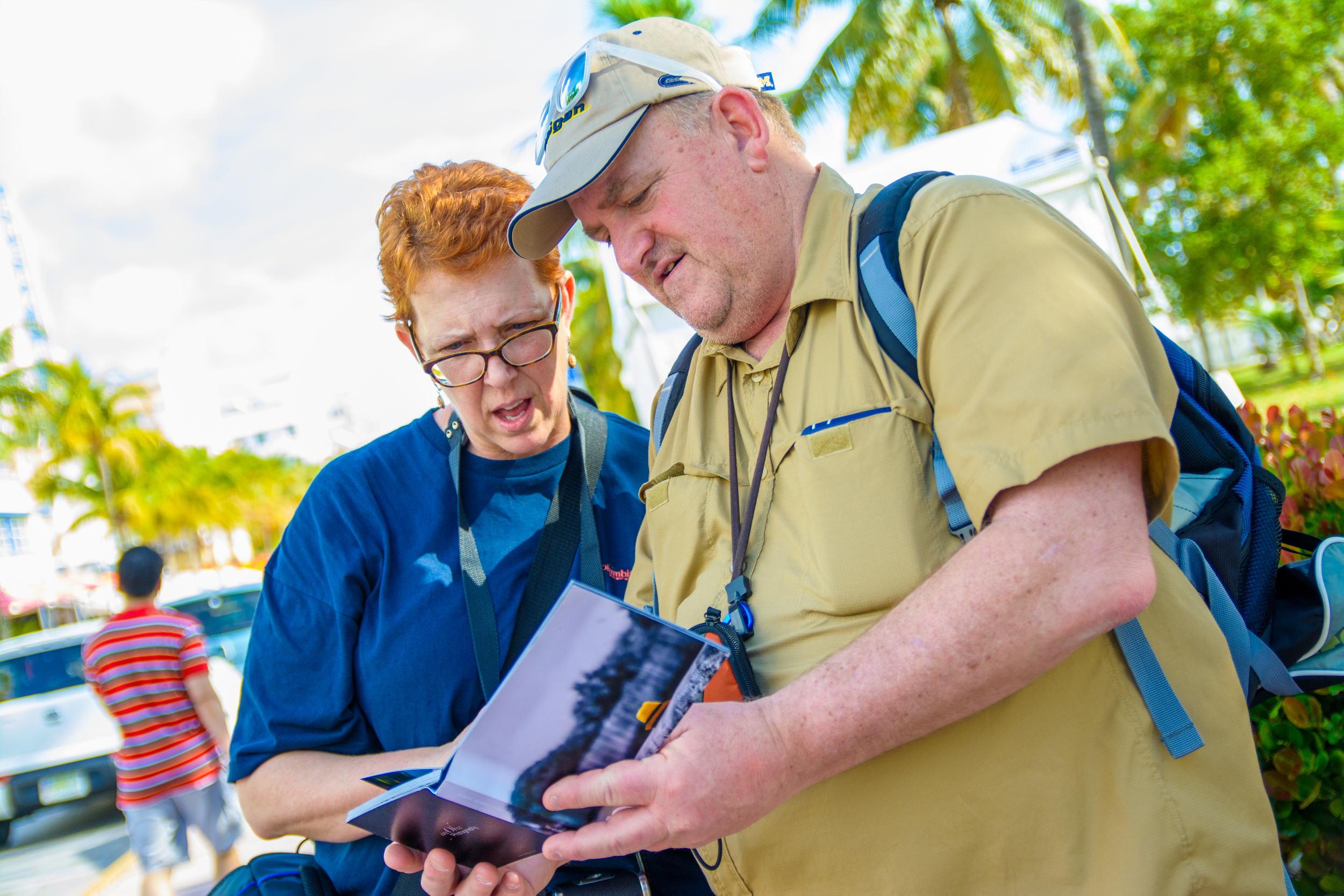
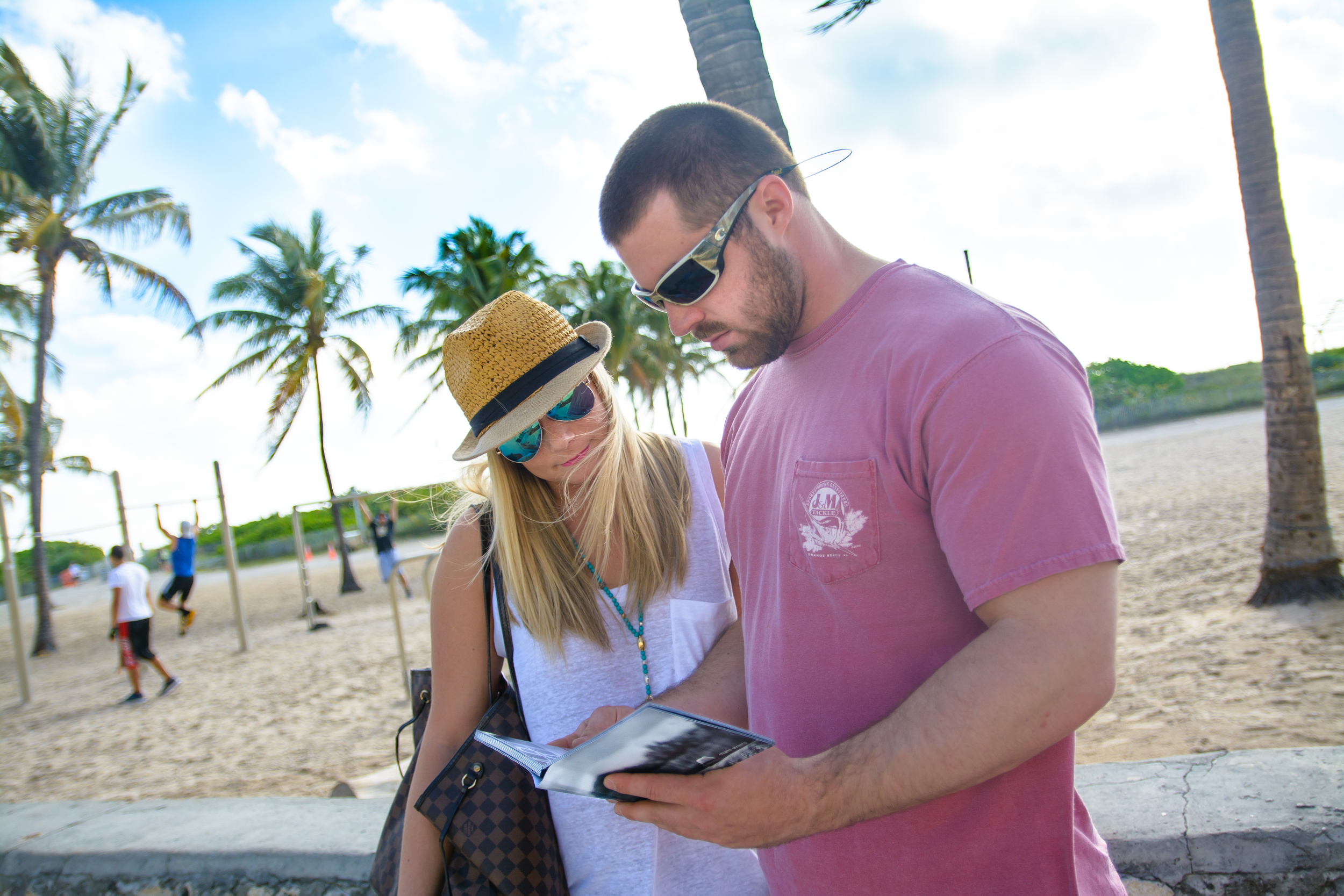
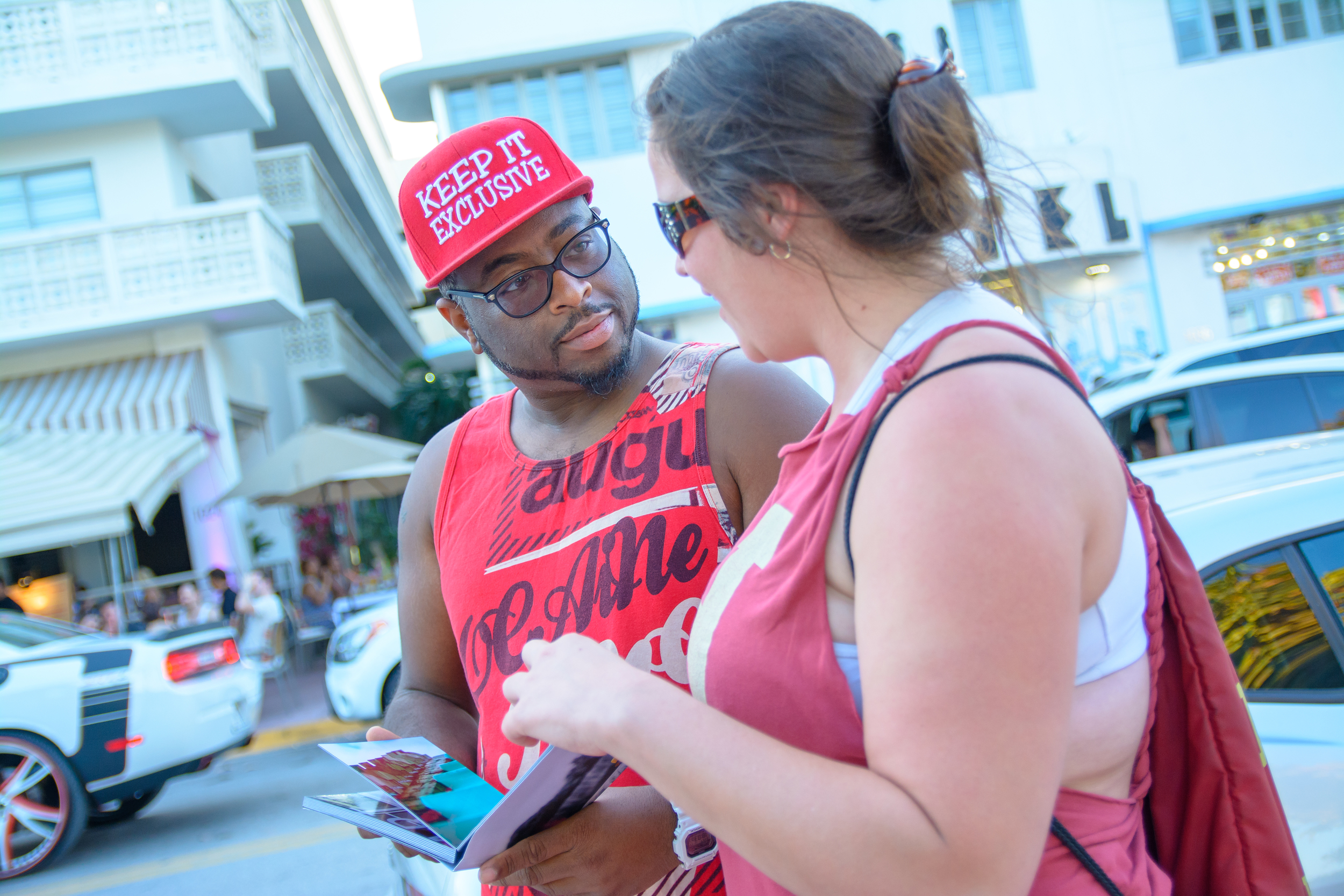
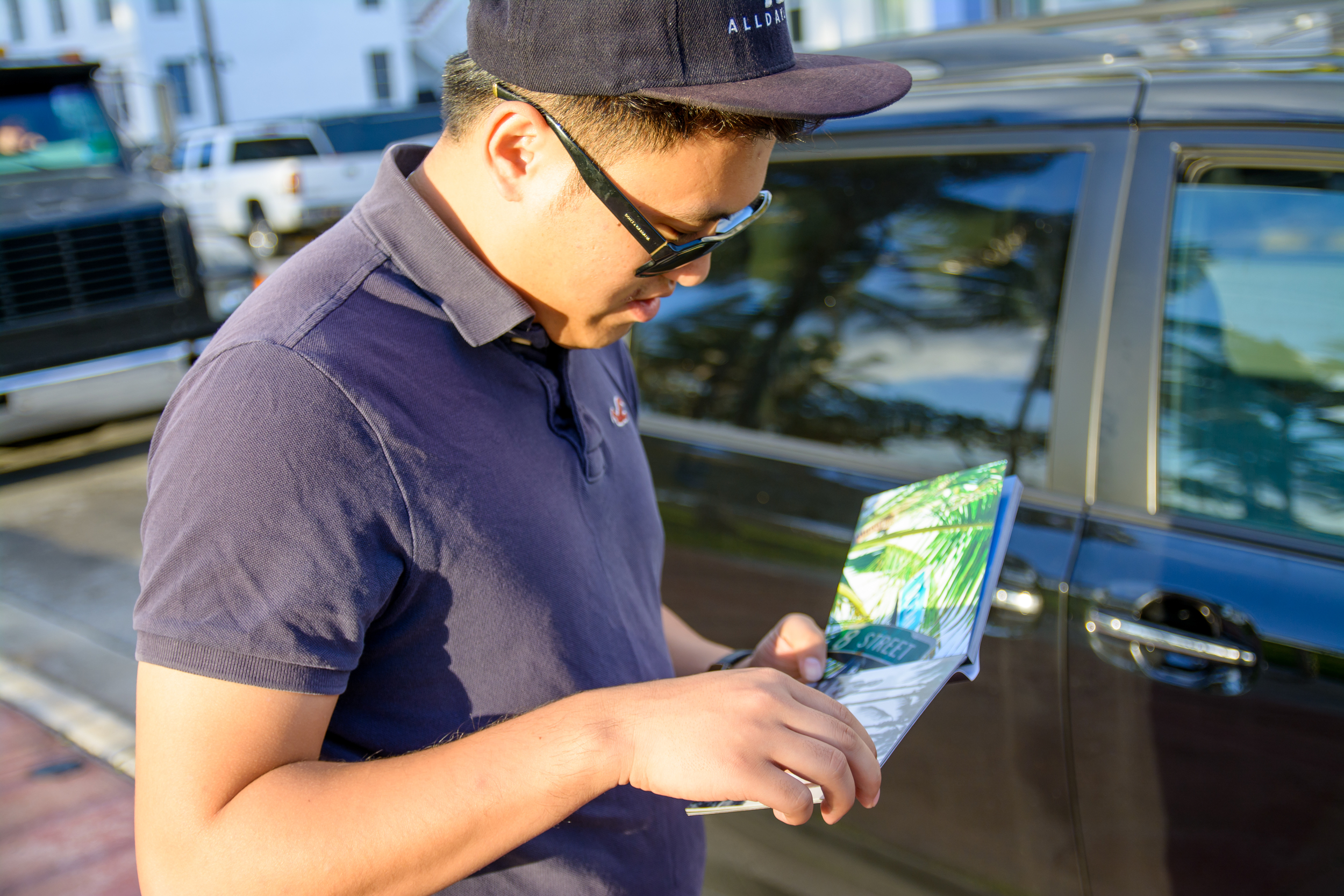
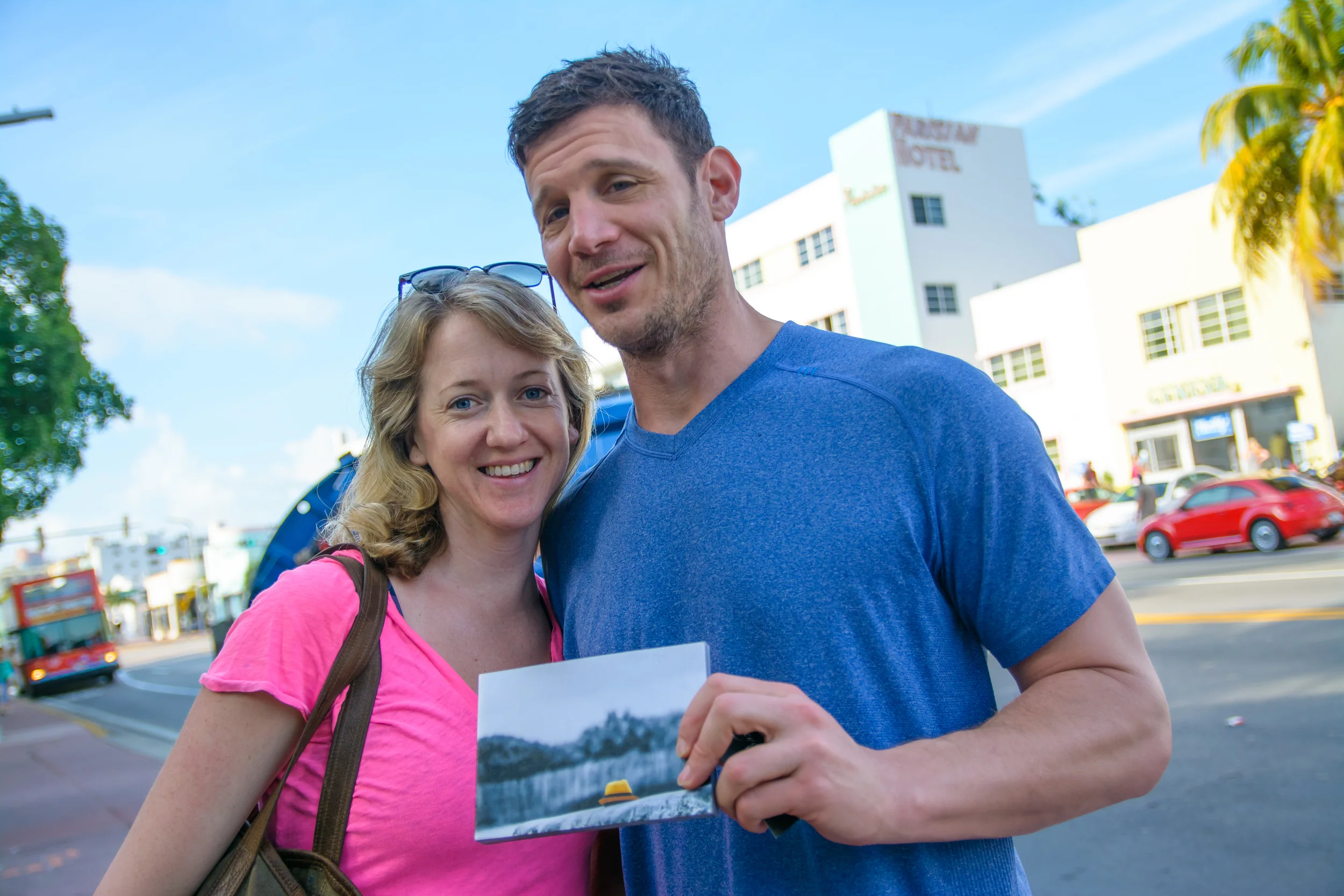
Nearly two years after the creation of miami streets, I returned to the very location. While there, I asked tourist and locals what they thought about the artwork. There was an overwhelmingly positive response to the ART book. In most cases, many were in disbelief that I actually captured these images. I'll try to take that as a compliment. Some even thought these were taken from a well known international travel/cultural magazine (hint it starts with NG wink wink). Which I would take as an absolute compliment. I am a true fan of the company and their talented artists that share their visions with the world. Anyway, I had the opportunity to meet some amazing people. It was a pleasure meeting them, sharing stories and getting their unfiltered honest opinions on the project.
The objective was to bring the art to the people. Allowing them to see the art created in the very location that they were standing. It was interesting seeing their reactions.
The first thing mentioned in almost every case was the look and feel of the book itself. The words "quality", "heavy", and "different" were used the most to describe the look and feel of it. Once they opened it, you could see the curiosity in their facial expression. Wanted to know more, at the same time wanting to flip to the next page. It was interesting to see how focused they were. I would ask a question and I would simply "get a" head nod. not even attempting to remove their eyes from the page. Which brought a bit a smile to my face.
I introduced them to two versions on Miami Streets. The content in the books are the same, but the physical construction are completely different. The first copy was the original which is constructed from professional lustre print. The second is Miami Streets Metallic which is constructed from the stunning metallic print. Miami Streets metallic was definitely an attention grabber. However, many really enjoyed the look and feel of the original. I guess it's safe to say that the finishing is a personal preference.
I was asked why I used both color as well as black and white? I asked why not? Combining the two forms of images creates a visual experience. I want you to not just enjoy what you are seeing but to also create a visual bond. By combining two forms of photography and two color scheme, it creates a multiple visual transitions. Finding the perfect balance is simply beautiful.
Over all, taking Miami Streets to its origin was phenomenal experience. I had the opportunity to meet so many people from so many backgrounds, to share one common purpose. The visual pleasure of fine ART.
Thank you Miami for allowing me to capture your beauty and allowing me to share my ART with you.
I would like to thank everyone involved. Thank you for sharing your time and feedback. It was truly an honor!
Learn more about Miami Streets
Place an order

